Airbrushing – Cleaning the Damn Thing
After my deep dive on airbrushing, I've received several requests asking for me to discuss my cleaning process. I get it. Cleaning sucks and it seems like it's probably one…

After my deep dive on airbrushing, I've received several requests asking for me to discuss my cleaning process. I get it. Cleaning sucks and it seems like it's probably one…
Ever since I posted about Black Basing a year and a half ago, I've wanted to follow it up with a better, improved version. And since I'm making the foray…
Recently, I was testing out a few new metallics, trying to sort out what exactly I want to use on the F-104. In that test, I came away rather impressed…

My recent rant against egregious panel line shading has drawn quite a hefty response. Plenty of voices of support...and of butthurt and defensiveness. A few who have mistaken the entire…

So this is the post where I get to shit all over other people’s builds!
Not really. Or at least, that is not my intent.
My intent is to talk about shading panel lines (mainly pre-shading, but also post-shading), and why – if you’re pursuing a realistic or verisimilitudinous finish, it’s a terrible technique that should be shunned and mocked.
Since there as been some confusion since I first posted this, let me elaborate on a few things.
First, let me say that pre-shading actually does some good. It gets modelers – including yours truly – thinking about paint in varying layers of opacity. For that reason alone, it’s often one of those game-changers that elevates people’s build quality, and I think that may be why so many stick with it so doggedly.
I mean, I get it. It’s contrast. And unrealistic, hyperbolic contrast is better than no contrast, right? Just look at the “house style” Hasegawa uses to show off their new kits. It’s utterly lacking in contrast or tonal variation. It’s…awful.

But for all the good panel line shading does, it’s bullshit. Here’s why.
It’s a ton of work. For any kit worth its salt, shading all those panel lines is an exercise in concentration and swearing.

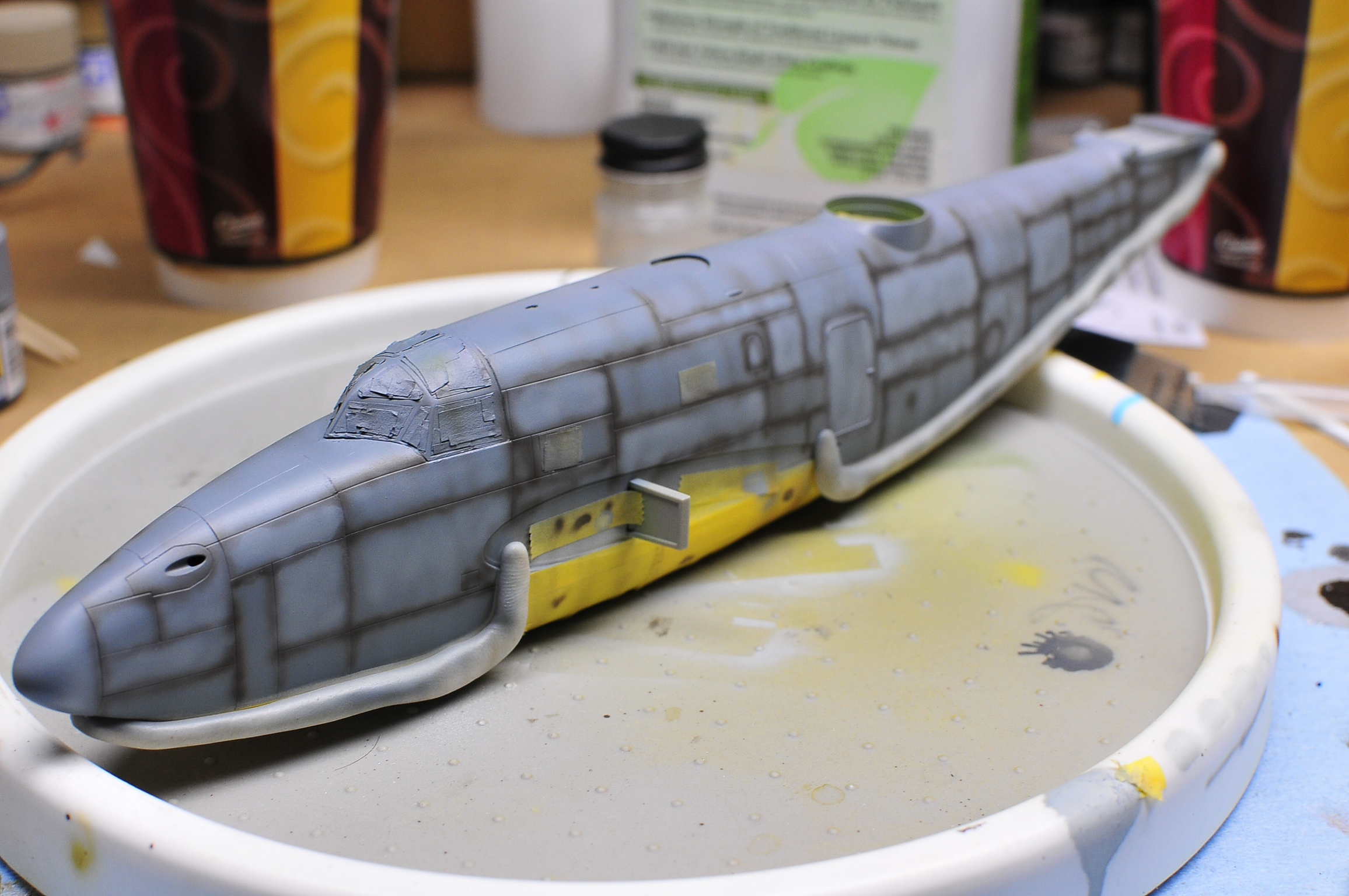
It’s unforgiving. Get a bit too happy with the airbrush and all that work is gone. Play it too cautious and you may have difficulties covering the gray primer or managing the contrast.

Third, it’s just not representative. Yes, the panel lines on some aircraft certainly do get filthy. But look closely. It’s never just the panel lines. And it’s very rarely all of the panel lines. The paint itself gets battered and dirty. Panel line pre-shading (and post-shading) totally misses this, and creates something that looks exaggerated and fake – like one of those overdone HDR images.
Note: I feel I should restate it here: if you’re going after a stylized representation, then by all means go to town. Just don’t make claims to verisimilitude. A Facebook commenter mentioned Monet, and I think that’s a fitting example! Monet was a great painter! But if he made claims impressionism was “realistic”, there would be a lot of laughing.
Look at this Spanish EF-18, for example.
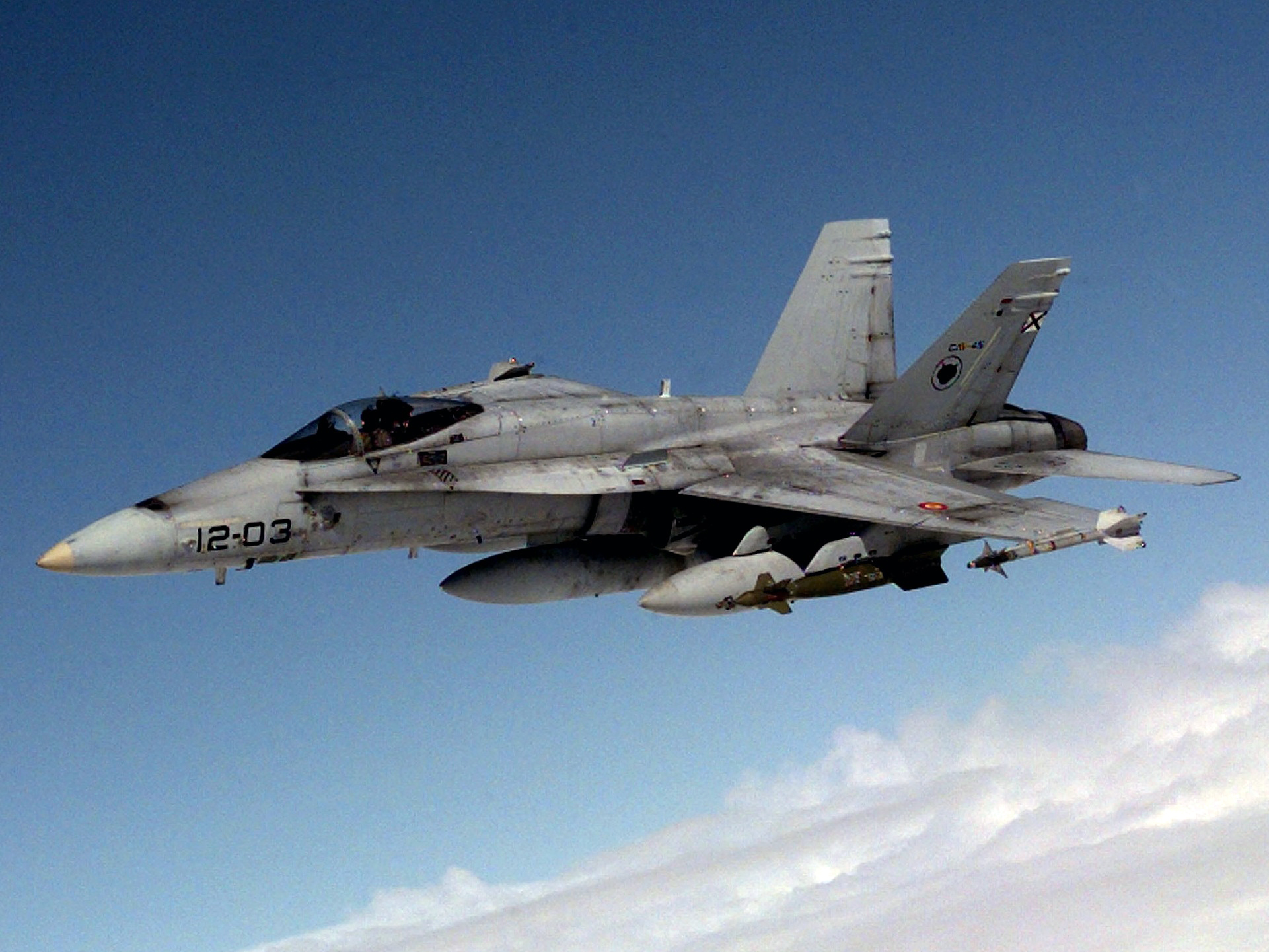
There are lots of visible panel lines…but they are not uniform. And the surfaces of the aircraft itself are filthy, especially around the wingroots.
Or consider this A-6 Intruder from Desert Storm. Plenty of visible panel lines, but they’re all fairly subtle, and there’s a lot else happening on the surface.

Now, I hate to speak ill of others’ work. And that is in no way my intent. But…I have to show examples of what I’m talking about. I’m not commenting at all on the quality of the build or even the rest of the paintwork, which in many of these examples is quite high indeed. I am only showing them to illustrate this technique/style of shading panel lines. If you’re getting upset reading this and want to get all defensive and butthurt about it, that’s okay. One of the examples I’m going to show won at the IPMS Nationals this year, so clearly there is some subjectivity at work. (more…)

With each new build, I try to push myself outside of my comfort zone (RELATED: Where the Magic Happens) in at least one area. Test a technique. Try a new paint. Experiment a little.
But every so often, a build comes along that’s more than that. That kicks me into an entirely new level of modeling.
Tamiya’s 1/32 F4U-1 Corsair is definitely one of those builds.

This kit has been, hands down, the best I’ve ever touched. It makes other good kits look decent at best. I knew even before I started building it that I wanted to give it a paint job that would match the awesomeness of the kit. I actually procrastinated for some time, unsure how to approach what I had in mind, until some experimentation showed me the way. (more…)

I’ll straight-up admit it. I’ve been procrastinating on my big Tamiya F4U-1 Corsair. Oh, sure, part of it’s been working on other builds, but a bigger part has been sheer anxiety over how I’m going to paint the thing.
The problem is pretty basic, really. I have a pretty reliable painting process that puts a lot of variation into potentially monochrome schemes – a must for a worn, faded, battered Marine Corsair serving in the South Pacific. I also have a need to introduce some fairly aggressive chipping and worn paint effects – a need that my black-basing process doesn’t really make provisions for.
I knew hairspray or some other kind of chipping solution would play into the answer, but how, specifically?
I decided to do a little experimentation to sort that out. (more…)

I’ve touched on the idea of tonal crush in a few posts here and there, but it occurs to me that I’ve never stopped to fully explain the concept – or its implications for modeling.
Time to fix that!
Tonal crush is, at its most basic, the apparent loss of tonal variation within a certain color, when placed alongside contrasting colors. The tones are literally crushed together, so that a color looks more monochromatic.
To explain why this happens, it helps to come in through a side entrance. (more…)
UPDATE: I'd recommend checking out the Black Basing video: I've never been a big fan of the standard pre-shading, where you trace panel lines in black and then try your…

Part I | Part II | Part III | PART IV
The end is in sight! It’s amazing to think I first started this kit more than five months ago…and that it’s been back on the bench for more than two.
So far, it’s been BUILT, PAINTED, and MARKED. Now comes the home stretch of weathering and seeing to all those final details. Here we go! (more…)