
What goes into a brand refresh, exactly?
Well that depends. It can involve consultants and agencies, or not, but it usually boils down to initially optimistic designers slowly having that optimism crushed into a fine powder by the stakeholders.
It’s a lot different when it’s a solo act. Especially when that solo act is very distinctly not a designer.
But there’s been enough interest in surfacing some of the backstory and thinking that’s gone into the logo and brand refresh, so here we go.
Shit needs to change
The first step for any change is the acknowledgement that change needs to happen. For me, it boiled down to three imperatives:
1. Evolve to a less martial look and feel.
The old logo had a more masculine, militaristic look to it. The font intentionally resembled a distressed stencil, the red stars fit the theme, and so on. And I wanted to get away from that.
2. Broaden the lens beyond ‘scale models’.
One thing I’ve been realizing over the past few years is just how much broader the world of miniature things really is. Scale modeling in the sense of IPMS shows and (primarily) military subjects is just one corner. There’s adjacent stuff like gundam or model railroading, but there’s also gaming minis, architectural models, roomboxes, even dollhouse builders. There are people who build scale things just so they can do crazy things with Photoshop.
There’s a world of neat stuff out there, and to me, ‘models’ just closes the door on a lot of it.
3. Reframe the focus of this site and my overall online activity.
Drawing off of 1 and 2, I had a desire to shift the overall vibe. Models doesn’t really capture everything I’m interested in, or (eventually) everything I’ll be dropping as STLs.
So a name change was in order, in addition to a new logo.
What’s in a name?
Why Doogs Studios?
Word selection is really where I’m in my element, and the key here was finding a word that would pay off those three criteria above.
A lot of options (Labs, Workshop, Garage etc) may get beyond “Models”, but they still scream “dude hobby” in a way that I don’t particularly want to.
Others veered too far in some other direction that lost the thread in a whole other way.
The closest runner up was Doogs Designs, which had the benefit of having alliteration going for it. But ultimately I felt Doogs Studios encompassed more area, and that intersection of designing and building (and printing).
Font hunting
With the name in hand, I started casting about for a new typeface. I knew that I wanted a big, chunky sans serif, but one with more flair than what Veneer brought to the table.
And man, finding it was a journey. A lot of options look great at a glance, but when you start putting them into layouts they end up looking like nothing. Or they’re too far out there.
Ultimately, I landed on Manometer Sans, which (to me at least) has enough spin on it that it won’t be confused for some kind of military stencil.
Star power
I did, however, want to carry forward something from the old logo. I decided pretty early on that it’d be a single star.
My first instinct was to also keep the red from the original logo, again as a touchpoint.

But as multiple people pointed out near-instantaneously, the single red star gave off Russia vibes. Which, yes it 100% did. I was too close the idea of carrying that legacy color forward that I missed a pretty fucking actual red flag.
Red had to go. But what to replace it with?
Within my family, we tend to each have a go-to color for things like water bottles, charging blocks, and the like, to easily tell what belongs to who. Mine has become yellow. So I have a yellow water bottle. A yellow phone case. Yellow earbuds. And some other yellow stuff.

Yellow stuck, and I also shrank the star down to fit between the words as much more of a supporting element.

Modular branding
Okay, that’s all well and good for the logo itself, but I also wanted some flexibility to change things up.
The original idea was to switch up just the star. So maybe armor-related stuff would use an olive drab star, aircraft a blue star, you get the idea. But whenever I tried putting it into layouts, it didn’t look right to me.
Ultimately, using different color palettes for the text worked a lot better.
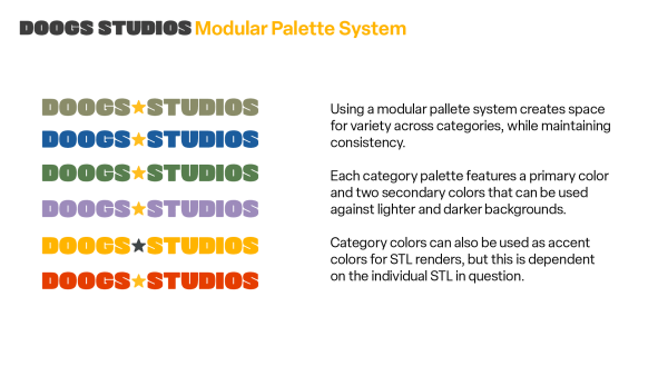
This way, each major category gets its own shorthand color (plus two secondary colors to maintain options among light and dark backgrounds).
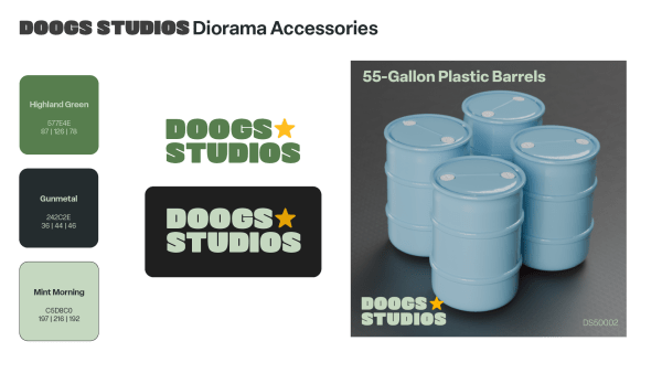
For the most part, the idea is to use the category variations for text, but they can also be used as accent colors in part renderings, like the end connectors in the Sherman T54E1 tracks, or the body of the Speaker of Unclear Purpose.


So that is, uh, that
There you have it, the general walkthrough of how the name and logo got refreshed.
I’m planning to carry the different category palettes into builds and video artwork as well, so keep an eye out!
Glad you’re back at it. I dig the different colors for different genres.
All I can say is: I dig it.
For someone who isn’t a designer you sure do design a lot of cool things. Including this new look!! Well done!
Think some of it’s just rubbed off on me over the years!
I’ve always enjoyed your word vocabulary in using seldom spoken words by the masses…. with the occasional “fuck” thrown in for emphasis. I’m drawn to it. Thanks!
As a red-insensitive dichromat (i.e. colorblind person), Faded Olive, Highland Green, and Hi-Viz Orange all look pretty much the same on my monitor. I don’t have a better solution, so don’t sweat it. I don’t need to see the logo color to know that track links for a Sherman will be in the military category, for example. Nice job on the logo design.
For someone who confesses to be “very distinctly not a designer”, you’ve done an absolutely bitchin’ job. Fair play 🤘
It’s great to see you back and on a Roll! Your Witt, and Talent will take you where you want to be! Big Mac in N.C.
This sounds great. Best of luck. One thought that occurs to me is the storage/tools category. People are always looking for innovative ways to store more stuff in less space. And its a category that cuts horizontally across all hobbies, not just models. There are some storage solutions out there that are built in pressboard or other similar products. They come in set dimensions. But if you could have a system that allows you to print, build and cut so you can customize shelves and drawers, racks, etc. into the space you actually have as opposed to adapting the space to components whose dimensions you cannot change, then you’d have something….
Hi. Your call by I’ll miss the doogs models brand. Can’t you keep the old site as it was?